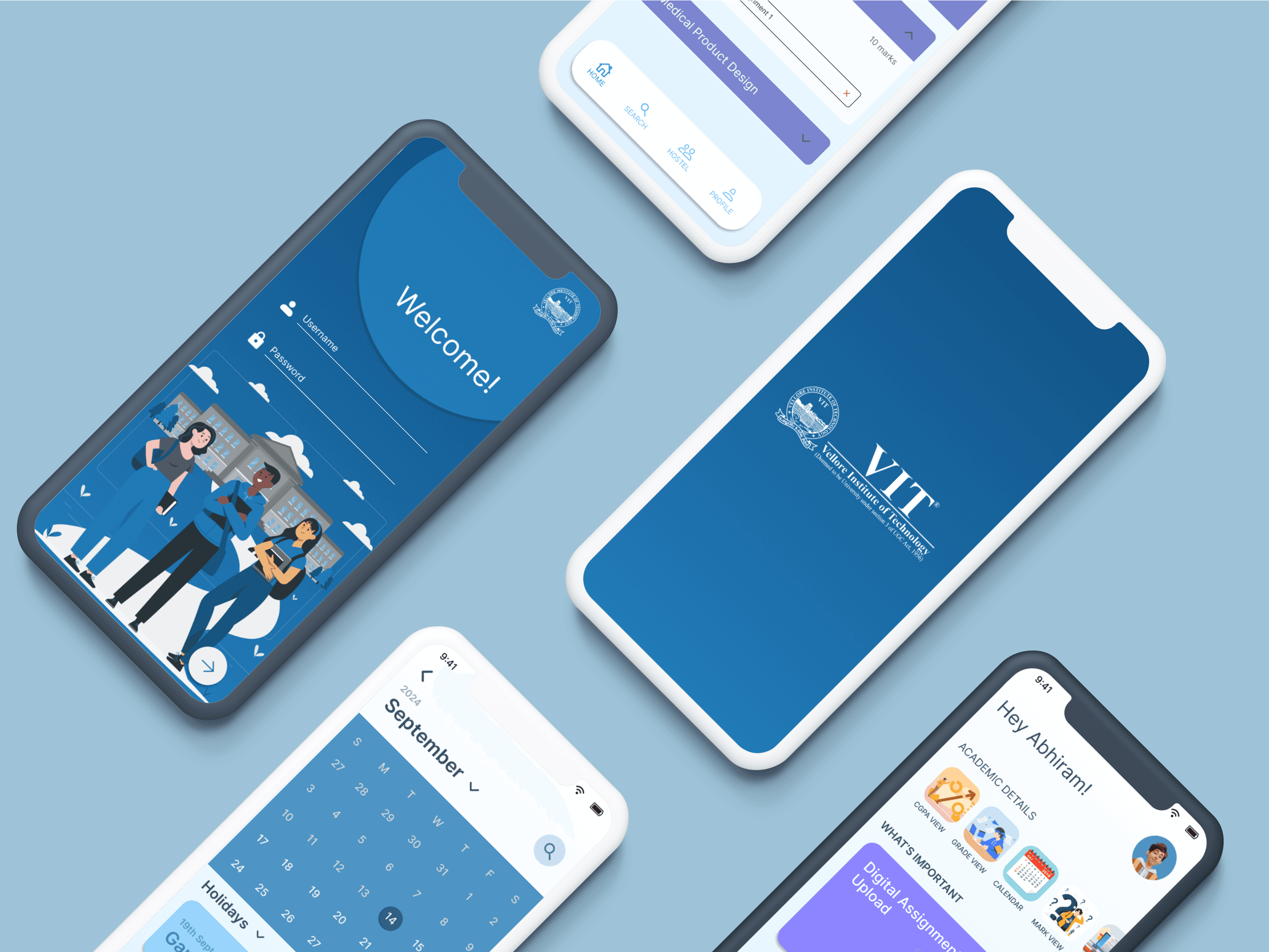
Vitian App
VIT mobile app for students of Vellore campus, App will help students with their routine academic activities in the campus.

Exam:
It notifies the user on the day of exam with the information regarding the venue, time and the subject of the exam.
Assignment:
It notifies the user regarding the assignments given on that day which is really helpful in case the students forget about it.

Introduction
Current app Screens
About the app
Onboarding Screen
Home Screen
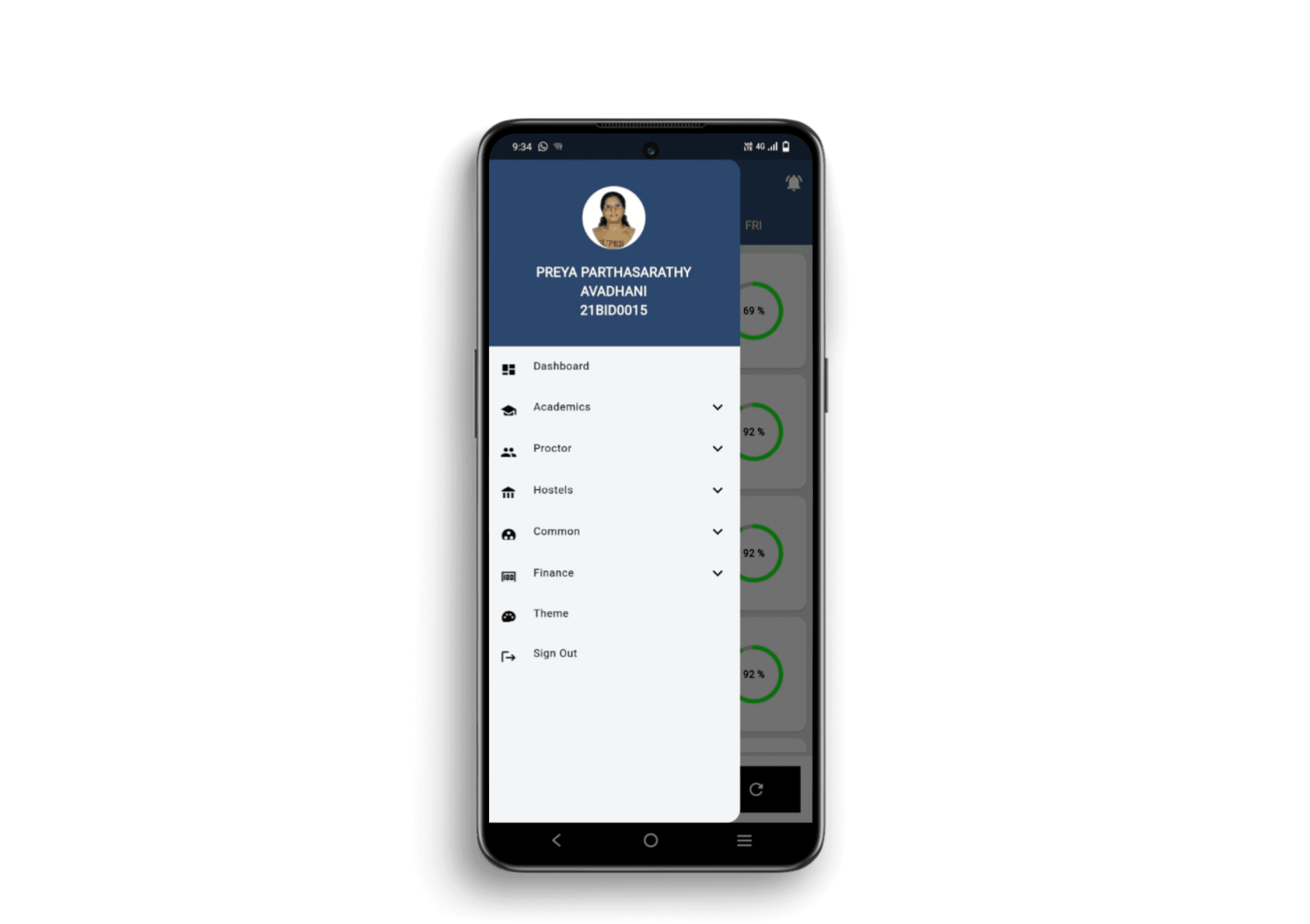
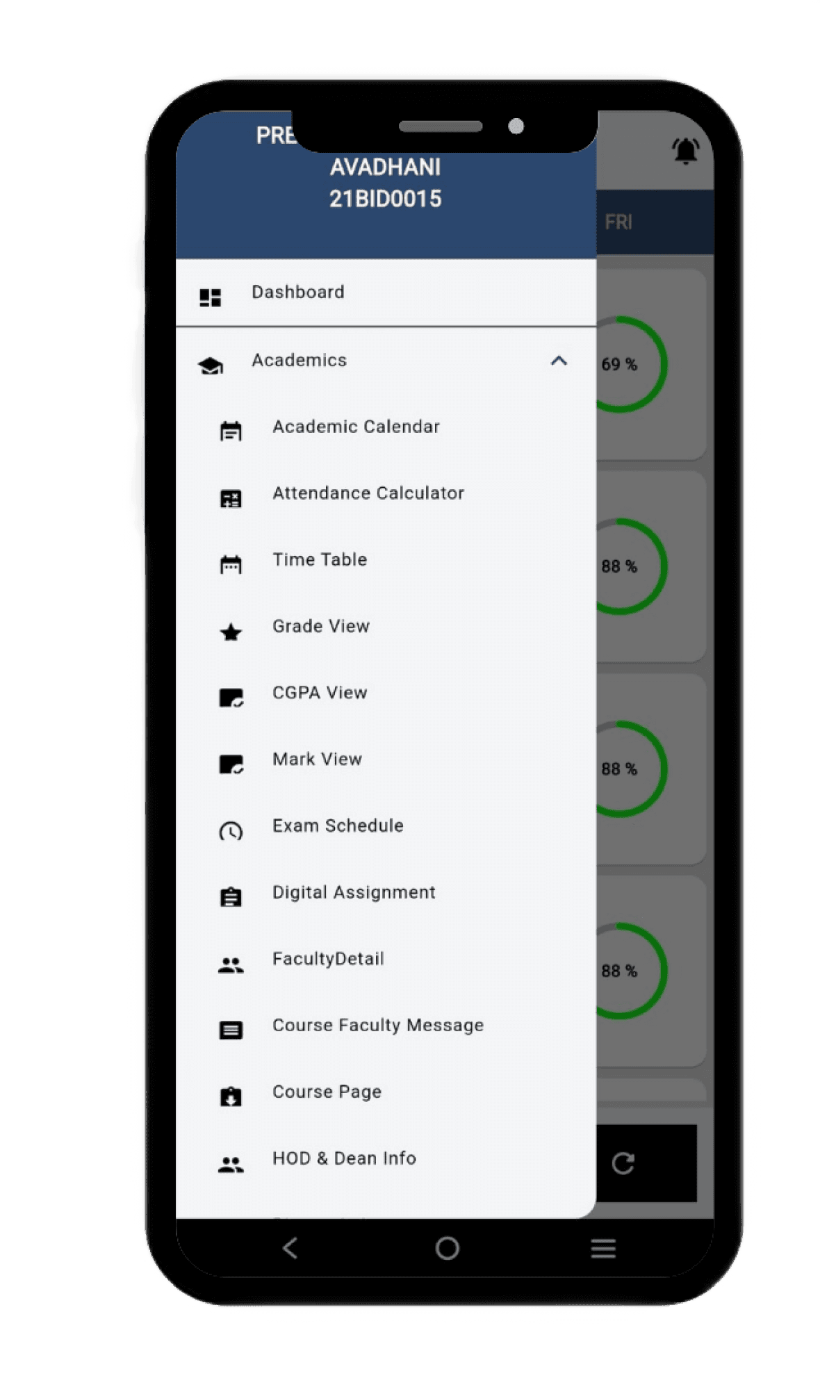
Side Drawer
UI/UX Design
Prototyping
The Vitian app is used by all the students inside Vellore campus. It maintains a record of all the student activities happening inside the campus like attendance, marks, academic calendar the other factors too...
Positive things about the app
Heuristic Evaluation
Negative things about the app


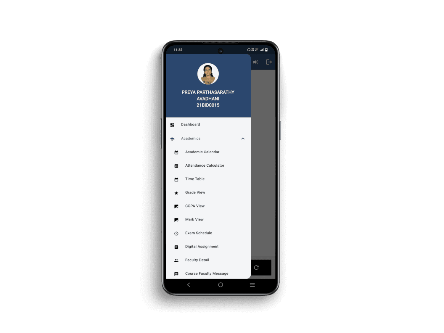

Too many options available:
In case the user is in a hurry due to too many options the user can’t find that particular options easily in the side drawer.

Bad calendar UI:
The academic calendar section only shows the exams finished and the lab exams, there isn’t proper information regarding the holidays or the instructional days.

<
s
m
t
w
t
f
s
5
6
7
8
9
10
11
1
2
3
4
19
20
21
22
23
24
25
26
27
28
29
30
31
12
13
14
15
16
17
18
Appointment
Not very interactive UI:
The user interface of this app isn’t very familiar with the other apps so users using it for the first time might face difficulty..

Some options are not clear about what they actually mean

Visibility of System status
Match between system and real world
User control and Freedom
Error Prevention
Recognition Rather than Recall
Help and Documentation
Help Users Recognize, Diagnose, and Recover from Errors
Aesthetic and Minimalist Design
Flexibility and Efficiency of Use
For the users who first enter the app they do not know how to proceed as the main dashboard includes the attendance details
The only option available for them is the hamburger menu so the users tend to click this option for further details
Clear drop down menu icons to search the sub options that come under the main option
Users often perform actions by mistake. They need a clearly marked "emergency exit" to leave the unwanted action without having to go through an extended process.
Here the user is asked for confirmation about whether he/she is sure if they want to Log Out
Good error messages are important, but the best designs carefully prevent problems from occurring in the first place.
For applying leave if there is any error in terms of writing the date then the user is informed about it through the pop up message before submitting.
Icons make it easier to recognize which option is regarding what.
A search button would make it easier to search what option he/she is searching for.
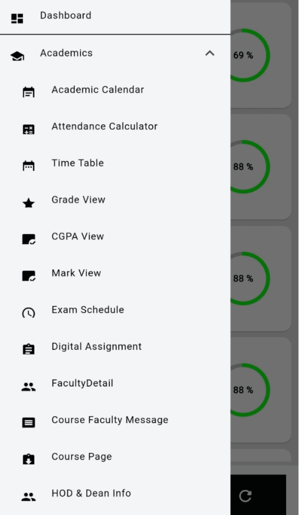
The user has to check through each and every option to search what he/she is searching for because each and every option has many sub topics under it.
It’s best if the system doesn’t need any additional explanation. However, it may be necessary to provide documentation to help users understand how to complete their tasks.
There is no option such as Help/FAQ like that where the user can go in case of any query
For students who have uploaded some other document in the digital assignment upload section there is no option as such where they can delete what they uploaded.
Also there is no pop up asking to conform the submission. As soon as the user selects the document it gets uploaded.
This option only allows the student to re - upload in case the user has uploaded the wrong document .
There are some options that are regularly used by users and some that are never used. Organising them properly might help the user navigate easily
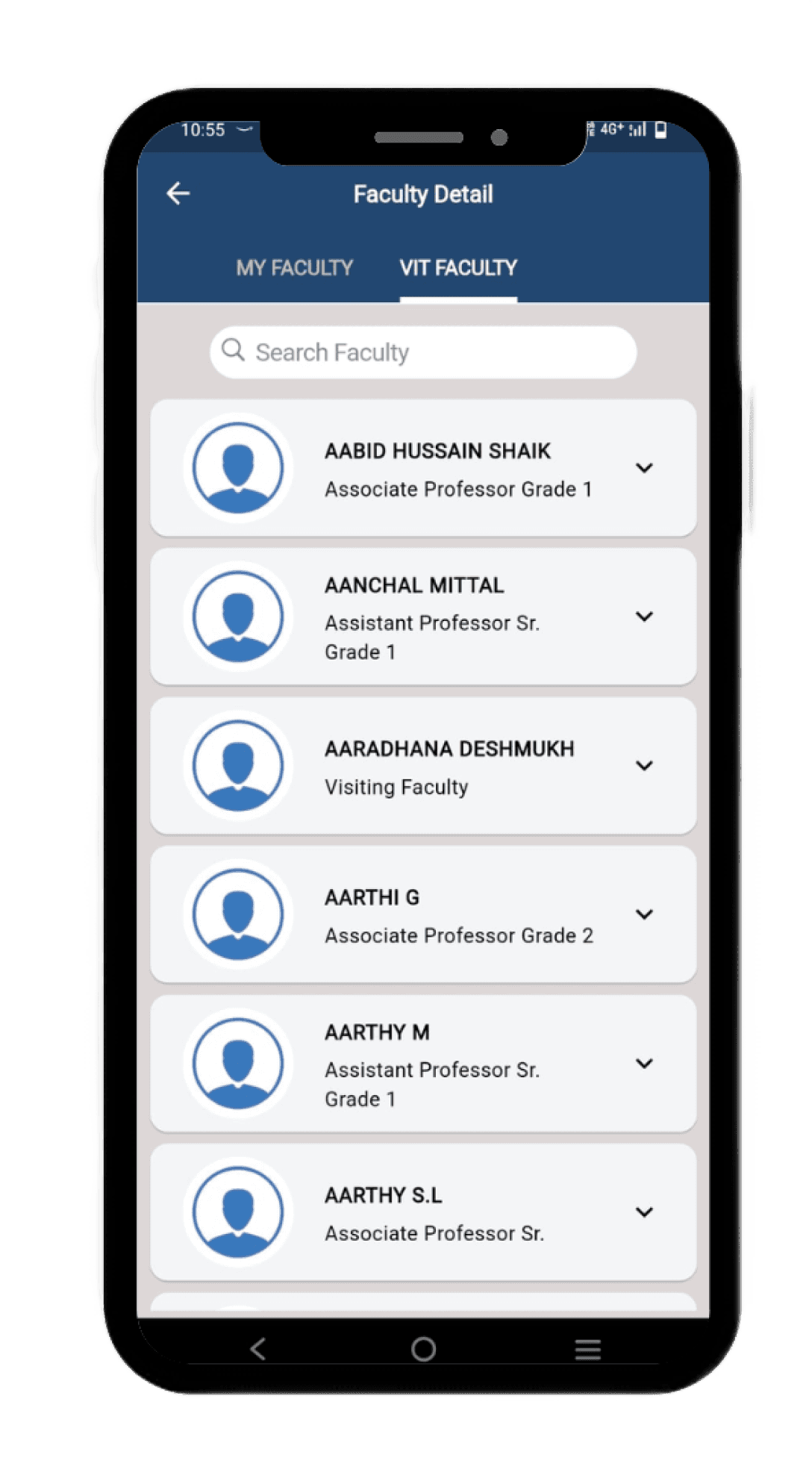
In Faculty Detail section there are two options given where the user can search about the professors who are currently teaching him/her or have taught him/her before.
There is another option given to search for the professors inside the VIT Campus
Consistency and Standards
Users won’t identify this as the home page/dashboard of the app with only the hamburger icon at the top where they can see all the options.


Additional options given which are not really required as the user can see his attendance and the time table in Dashboard
This option is really not necessary as it just talks about the past notification provided by the app to the user
Notifications option that directs the user to this page
In digital assignment upload section in case the user wants to upload again then this screen is visible.
For users who are using the app for the first time won’t know what this OTP option is for.
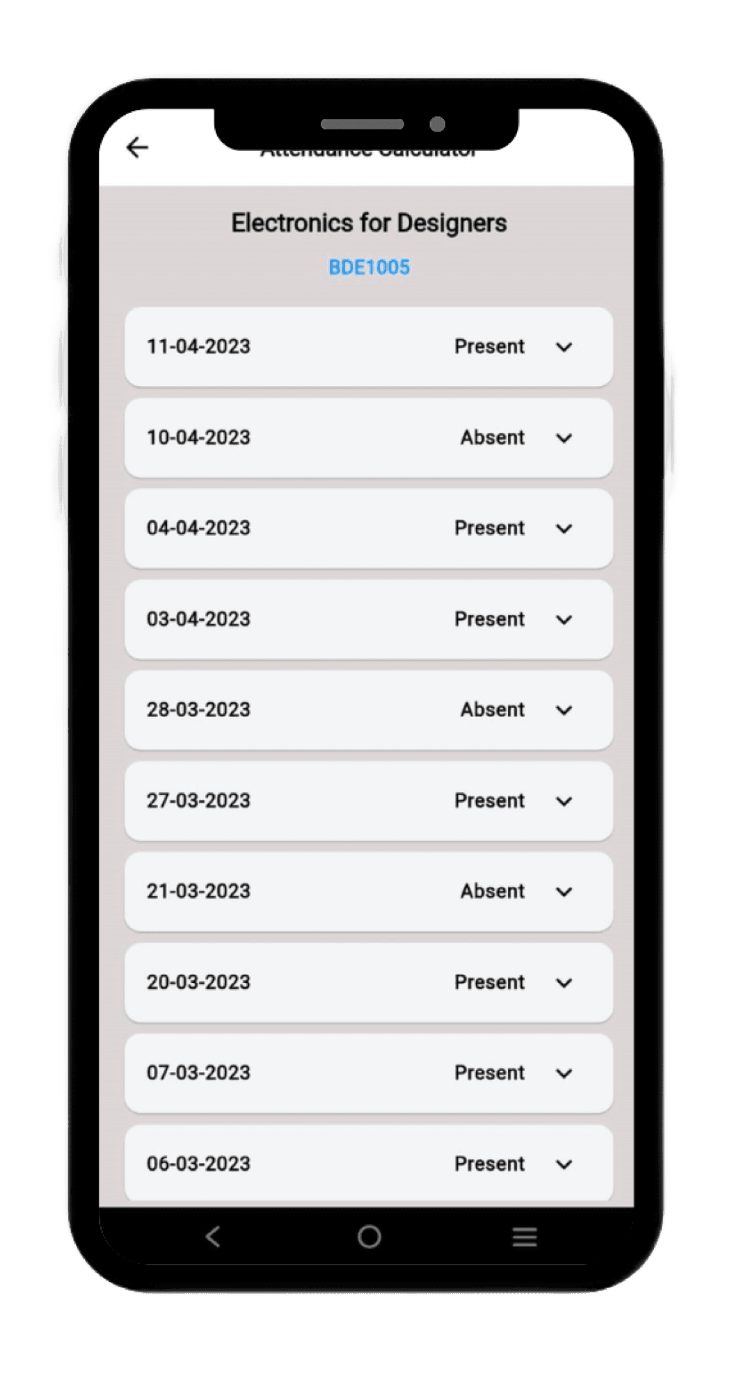
Users need to scroll through the classes in order to check at what days they were absent and what days they were present
There isn’t a clear graph indicating about the days they were present/absent seperately.
The option should be document re-upload in case the user submitted some other document by mistake.

Simple terminologies are used and options given to search each and everything related to academics


For academic calendar there isn’t a proper calendar type format where the users can see the holidays and the instructional days.


User Persona

Ojashwi
VIT Student
GOALS AND NEEDS
CHALLENGES
FEAR AND FRUSTRUATIONS
“Ojashwi is a hardworking 4th-year MTech student dedicated to her studies. She uses the Vitian app regularly in order to access the notes provided by professors, submit assignments and keep a proper track on her attendance. ”
Ease of submitting assignments
Easy navigation through app
Clear instructions
Difficulty to search other options available in the app
Difficulty to cancel the uploaded assignment in app.
Due to the unavailability of cancel upload option in the assignment upload section there can be chances in case she submitted the wrong assignment and is visible to the professors.
21 years
Lucknow
4th yr Mtech Student
Icons
Text
Inter
Header - 32px
Sub heading - 24px
Starting screen with logo
Log In / Sign In
Home Screen
Grade View Screen
Logo
Enter the student username and password
Username
Password
Horizontal Scroll option for academic details
Grades would be displayed for different subjects
Grade view option
Dropdown for choosing semester
Vertical Scroll option for digital assignment upload and attendance calculator
CGPA view option
Home Screen
Hostel Info
Search
User Profile
CGPA details of the student
Home Screen
Calendar Screen
Mark View Screen
Digital Assignment Upload Screen
Digital Assignment Upload Screen
Mark View Screen
Calendar for a particular month
Display for holidays for that particular month
Display of subjects for that particular semester
Dropdown option for assignment upload section for different subjects and delete option beside in case the user wants to delete the submitted assignment
Display of marks for FAT, CAT I AND CAT II
Pop - up menu option in case the user clicks the delete option regarding if he/she wants to delete the assignment
Home Screen
Attendance Calculator Screen
Attendance Calculator Screen
Display of attendance percentage of student
Dropdown to select the days present / absent
Display of the days when the student was present
Protoyping Link -
Usability Testing
Was it easy for you to navigate through the app?
Can you understand the meaning of words/icons used in the app?
What feature do you like the most in the app?
In terms of consistency do you find the app similar to the previous design?
Yes
The cancel option for assignment upload option
The important things like attendance and assignment upload at the top in home page
Yes
No the entire layout is changed
No it is different
Looks more like an educational app. The upgradation is good.
Additional options for attendance calculator like classes that can be skipped options can be added
Conclusion
Questions asked to the User
Was it difficult to understand the current UI of the app?
Was it difficult to understand the current UI of the app?
User 1
No
No
User 2
What do you think about this project?
Do let me know :)

Wireframe